84.6% Reduction in the Volume of
Users with Blocked Accounts
How a structured discovery and redesign of the KYC onboarding flow dramatically reduced blocked accounts and improved activation rates for Swile's employee app users.
Users blocked from accessing their own benefits.
A significant portion of new users were getting their accounts blocked during the KYC verification process — unable to activate their card or access their employee benefits.
- Users unable to access their employee benefits card after registration
- No clear feedback in the app about why they were blocked
- No self-service resolution path — required manual support intervention
- Frustration during a critical first-use moment
- High volume of support tickets related to blocked accounts
- Increased operational cost from manual unblocking workflows
- Poor NPS scores tied to onboarding experience
- Risk of early churn before users experienced the product's core value
Mapping the problem before designing the fix.
Before touching the interface, the focus was on understanding the root causes. Through support ticket analysis, user interviews, and data from the KYC funnel, it became clear that users were failing verification not because of bad intentions — but because of poor guidance, unclear error states, and a lack of recovery paths in the app.
The solution combined flow redesign (clearer KYC steps, real-time feedback, and self-service recovery) with improved communication — giving users both the information and the agency to resolve issues on their own.
No guidance during KYC steps + no recovery path after failure
Discovery → flow mapping → redesign → test → iterate
84.6% reduction in blocked accounts after rollout
End-to-end ownership from discovery to delivery.
- Led the end-to-end UX process: research, mapping, design, and validation
- Conducted user interviews and usability tests with real blocked users
- Analyzed support tickets and NPS data to identify friction patterns
- Mapped the "As Is" KYC flow and identified the critical failure points
- Designed the improved flow and new error/recovery states in Figma
- Collaborated with the PM and engineering to define scope and prioritize
- Ran usability tests on prototypes before development handoff
- Tracked post-launch metrics to validate impact
Research, design, and iteration in parallel.
UX Research
- User interviews with blocked users
- Support ticket thematic analysis
- Funnel drop-off analysis
- NPS qualitative review
- Benchmarking of competitor KYC flows
Design & Interface
- "As Is" user flow mapping
- Problem framing & insight synthesis
- Redesigned KYC flow with recovery states
- High-fidelity prototyping in Figma
- Error and empty state design
Agility & Validation
- Usability testing on prototype
- Collaborative prioritization with PM
- Phased rollout with metrics tracking
- Post-launch A/B observation
- Iteration based on real usage data
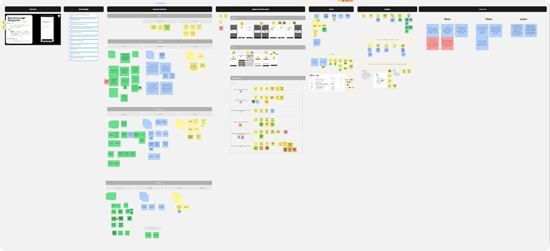
Project structure and tracking.
The project was managed in Notion with a clear breakdown of research tasks, design stages, and delivery milestones — shared with the PM and engineering squad.


A measurable shift in activation quality.
Reduction in blocked accounts
Significant drop in KYC-related support tickets
Improved time-to-first-use after registration
The redesigned KYC flow gave users clear guidance at each step, real-time feedback on their verification status, and a self-service recovery path when something went wrong. Post-launch monitoring confirmed the dramatic reduction in blocked accounts, while support ticket volume related to KYC dropped significantly — freeing the operations team from reactive manual work.
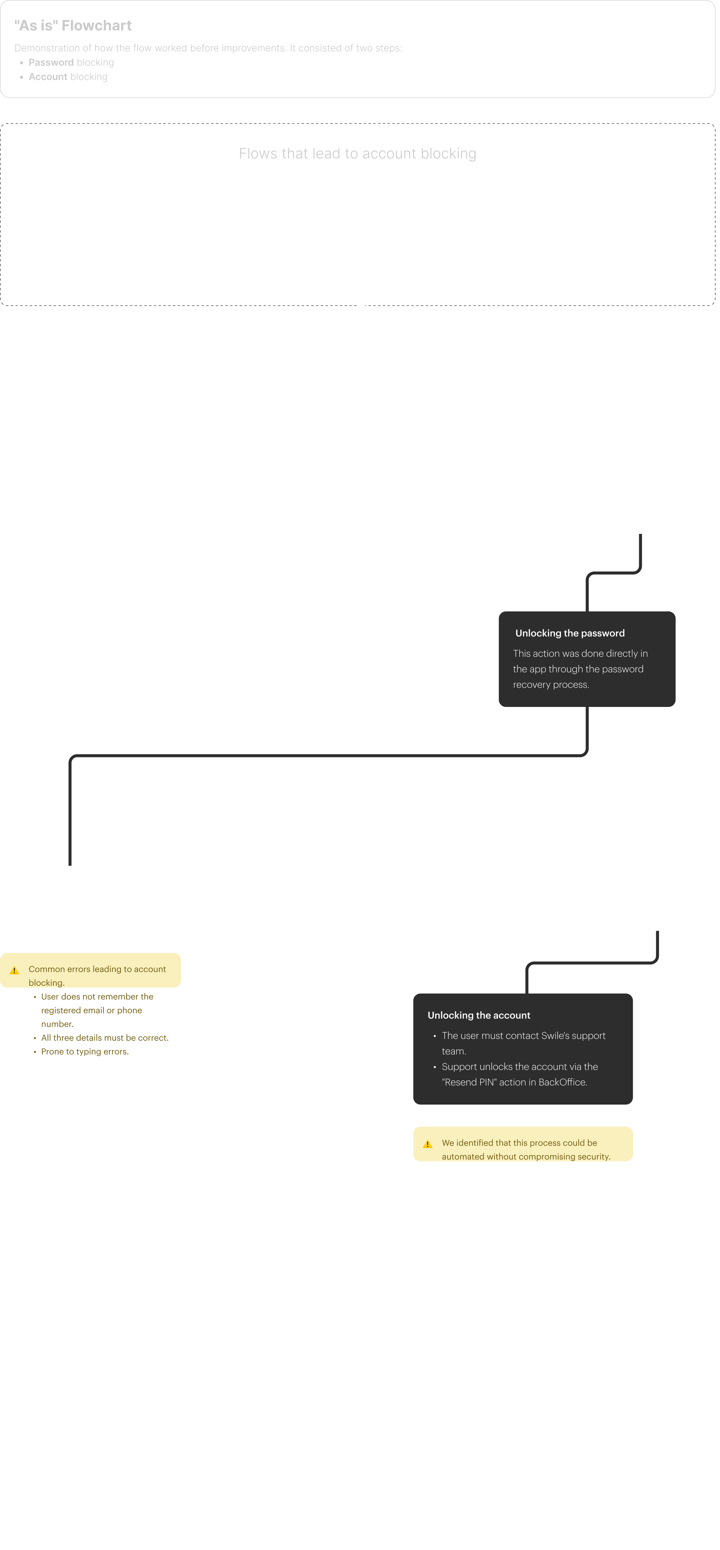
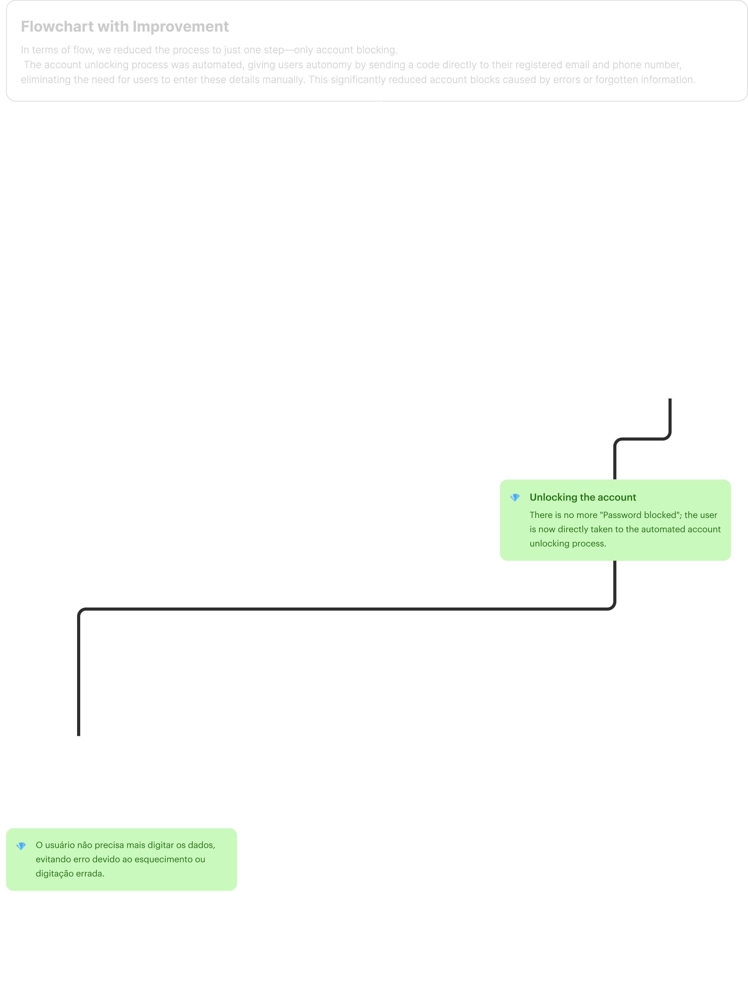
Before and after — mapping the user journey.
Visualizing the original broken flow and the redesigned path helped align the team on exactly what needed to change and why.
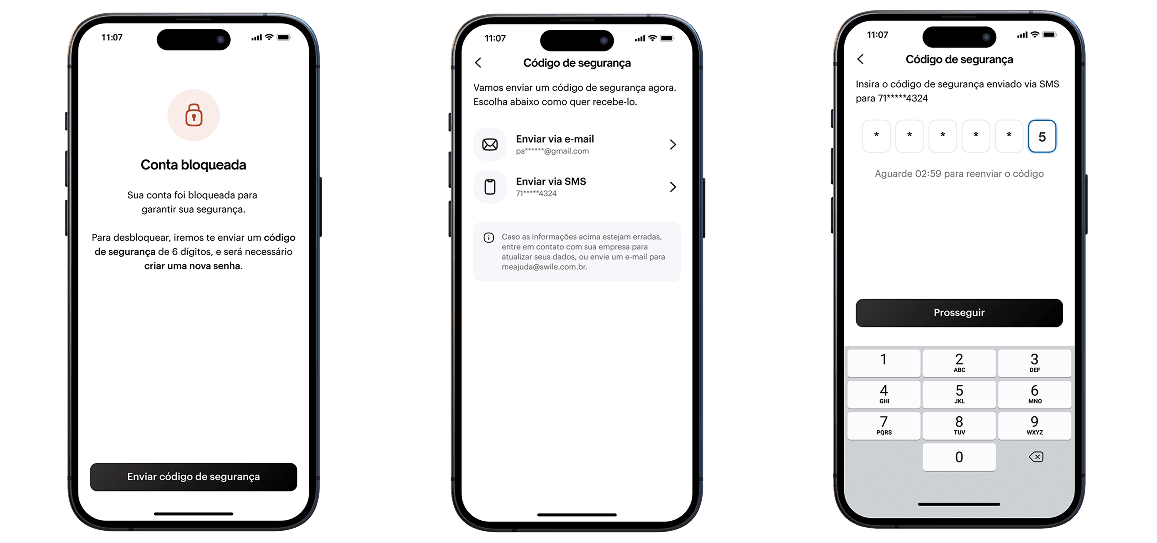
Screens that guided users through.
The redesigned screens introduced clear progress indicators, real-time validation feedback, and explicit error recovery flows.
Better guidance beats stricter gatekeeping.
Most users weren't trying to game the system — they were confused. Giving them clarity and a recovery path was enough to resolve the majority of blocks without changing the underlying verification rules.